8 Ways to Use Neutral Color Palettes in Interior Design
Neutral color palettes in interior design can be more than one value of white, beige, taupe, gray or black. The most versatile of these colors are white (reflects all colors) and black (absorbs all colors). These are followed by beige, taupe, and gray.
How You Can Exploit Neutral Colors
The best thing about neutral colors is the ability to exploit the other colors that went into the formulation of the mass color (end result). In other words, that white you just selected from a paint chip might really be a blue-white instead of a yellow-white.
Undertones and Saturation
The amount of saturation in, for example, a blue-white depends on the amount of blue pigment added to the pure white color. In most cases, there isn’t a lot of blue saturation, just enough to give a blue under color or undertone. Any more and the white disappears and becomes the undertone of the color blue (mass color). Choose a neutral palette to build your design; neutral colors don’t appear in the color wheel so use that as your guide.
Light Gray, White, and Pale Pink Palette
The overall visual effect of this neutral color palette design is gray with pink accent colors.
A light and medium gray flooring accents medium gray furniture and accessories, such as a silver gilded gray frame.
The walls are white with undertones of gray, making it very compatible with the other grays in the decor.
The bedding is a mix of white and pale pink, with a darker pink featured in the rug, bedding and curtains.

Tan and Gray Palette
This neutral palette features two neutral colors, tan and gray.
The gray value is taken to a darker gray in the rug.
The pale and medium tans evolve into dark browns in the rug.
The furniture is a camel brown.
The sofa features a dark brown throw and tan/brown plaid pillow.

Brown, Gray, and Gold Accent Colors
This palette features a white backdrop for the ceiling color.
The main color is the light taupe used for the wall, carpeting, fireplace and a pair of love seats.
Two values are used in the geometric wallpaper and the shadowing of the rug creates light and dark colors.
The warm brown undertones of the taupe color are highlighted with chocolate brown and mocha throw pillows.
The gold accent color is repeated in a framed mirror, vase and art object.
Dark wood furniture carries the brown accent color throughout.

White, Taupe and Black Combination
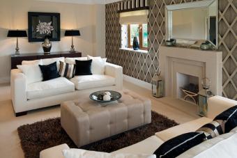
This color palette features a taupe background color with white accent colors represented by the pair of loveseats.
Darker taupe values are used in this design and evolve into a mocha brown.
Black is used as an effective accent color; navy would also work well in this particular example even though it is not technically a neutral and is a shade of the primary color blue.

Beige, Taupe and Gold Trio
This color palette is a beige background that supports a taupe accent wall with a medium beige draperies.
The sofas are a darker beige with the ottoman fabric combining the light and darker beiges.
Gold lamp shades and throw pillows serve as the accent colors.
The green and beige colors of the two floral arrangements introduce another accent color that is treated as a neutral color while the green becomes a focal point.

Beige With Brown and Green Accent Colors
The main background color is beige with green as a secondary color. Green is on the color wheel and not a neutral; however, it does look good when paired with neutrals.
Two variations of the beige are used in a darker value: one is taupe and the other is chocolate.
Both variations serve as accent colors.

Gray and White Room Colors
The gray and white palette is a mix of values ranging from medium gray for the wall and flooring with a white rug, bedding, and lamp shades.
A taupe throw and pillow are found on the foot of the bed.
These neutral colors backdrop and support the russet accent color of the bedframe and closet.

White, Gray, and Beige Combination
This palette features crisp white and several gray values, such as dark gray walls, a weathered gray flooring and another gray L-shaped sofa.
A beige rug supports a gray metal coffee table with a white top.
Pink is the accent color for this room along with a gold picture frame that is repeated with a gold bowl on the coffee table.

Creating Your Neutral Palette
A neutral palette doesn’t need to be pale or boring. Use more than one neutral color to add depth and interest to the other colors of your design. You can use the undertone of the neutral color to select an accent color for your décor.
AUTHOR: Sally Painter
DATE PUBLISHED: November 09 2021
SOURCE: Lovetoknow.com
PHOTO CREDIT: Lovetoknow.com


